- Deutsch
- Deutsch
- Deutsch
- Deutsch
- Deutsch
- Deutsch
- Deutsch
- Deutsch
- Deutsch
- Deutsch

- Deutsch
- Deutsch
- Deutsch
- Deutsch
- Deutsch
- Deutsch
- Deutsch
- Deutsch
- Deutsch
- Deutsch
- Deutsch
- Deutsch
- Deutsch
- Deutsch
- Deutsch
- Deutsch
- Deutsch
- Deutsch
- Deutsch
- Deutsch


- Deutsch
- Deutsch
- Deutsch
- Deutsch
- Deutsch
- Deutsch
- Deutsch
- Deutsch
- Deutsch
- Deutsch
- Deutsch
- Deutsch
- Deutsch
- Deutsch
- Deutsch
- Deutsch
- Deutsch
- Deutsch
- Deutsch
- Deutsch
- Deutsch
- Deutsch
- Deutsch
- Deutsch
- Deutsch
- Deutsch
- Deutsch
- Deutsch
- Deutsch
- Deutsch


- Deutsch
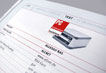
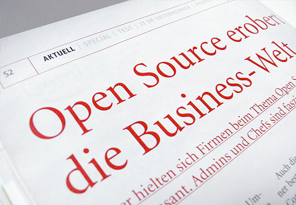
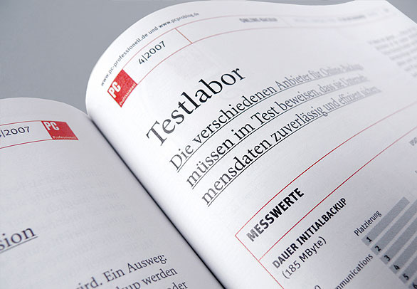
Auftraggeber
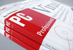
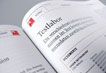
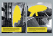
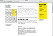
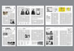
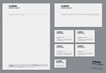
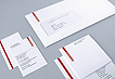
PC Professionell
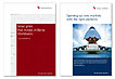
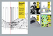
It is pretty unusual for a trade magazine to change its look as drastically as this. Our task as designers was nevertheless to make the content look good and not show off with all sorts of graphic gadgets. The aim of the re-launch was to was to precisely define the profile of the publication. A contemporary design language was to communicate PC Professional as the best test magazine for professional users.
With as much coherence as possible and as much differentiation as necessary, the design now takes care of the visible identity of PC Professionell. The new cover of PC Professionell presents itself as sleek, precise and purist, concentrated on the important things.
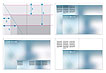
The design offers support for longer copy that needs some leisure time, for information that is scanned quickly, and for facts that need to be studied intensively. The layout makes it possible to start reading at various points in the copy, and to navigate effortlessly between parts of the magazine to pay proper attention to important facts.


Auftraggeber
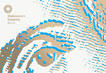
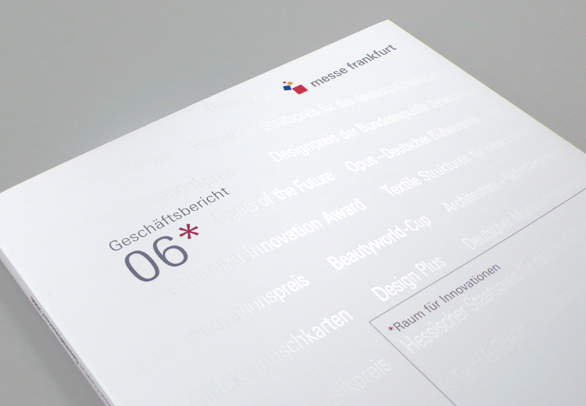
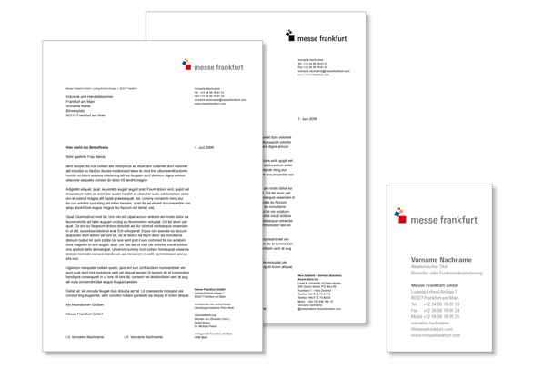
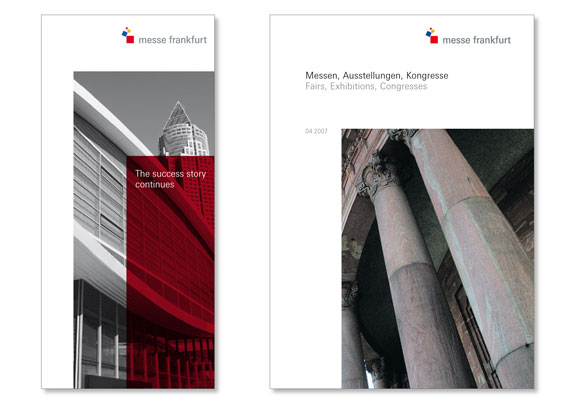
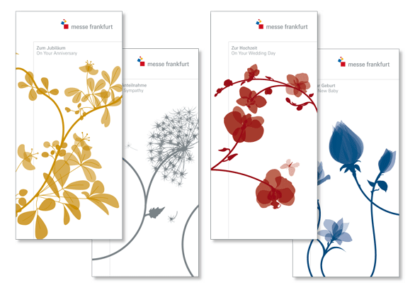
Corporate design for Messe Frankfurt
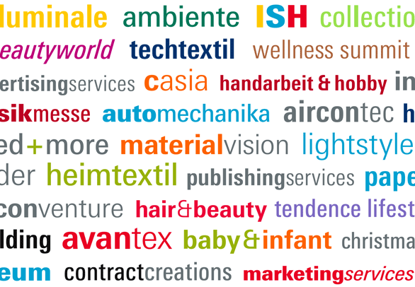
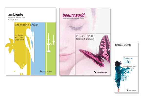
Messe Frankfurt organises over 100 trade fairs of many kinds worldwide, each with its own logo and individual visual image. One of the major aims of the redesign is to capture this diversity by allowing maximum freedom of design for the events while at the same time strengthening their relation to the umbrella brand.
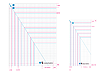
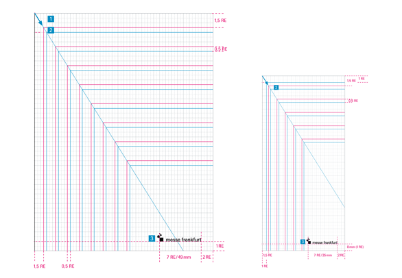
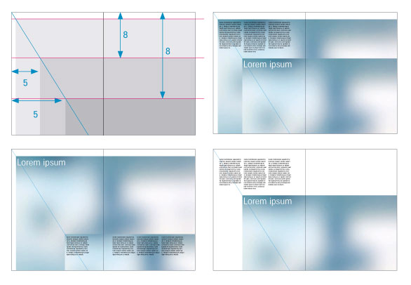
The layout principle is derived from the proportions of the picture mark. An unmistakable characteristic is achieved by specifically arranging design elements in the relation 5:8. This creates a visual relationship between the look of the company and the individual products.
Its own in-house typeface, ‘Messe Univers’ helps attain this aim. All event brands are set in this face, so that they now speak one language.


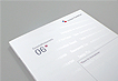
Auftraggeber
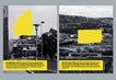
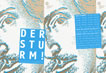
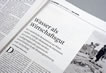
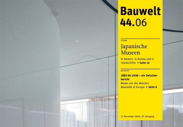
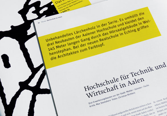
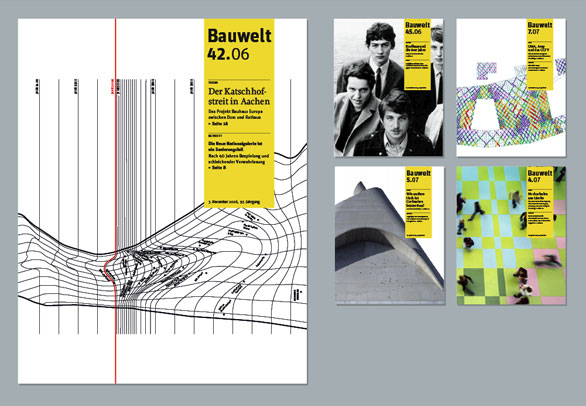
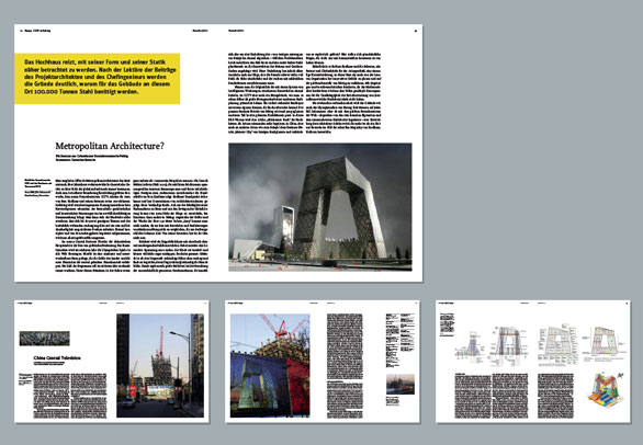
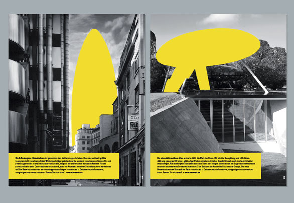
Redesigning Bauwelt
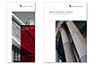
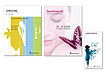
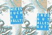
Bauwelt is the leading intellectual opinion-former among German architectural magazines. It’s up to date, respected, self-conscious, elitist, critical, intellectual, strict, purist, pithy — and had become somewhat dated in its design.
The new design aims to retain the ‘purism’ beloved of its readership, while taking into account changing reading habits and generally better defining Bauwelt as a brand.
Yellow is revived as brand colour, and represents the conceptual and visual profile of Bauwelt. While its use was restrained in the past, it’s now the design staple that joins the publication.


Auftraggeber
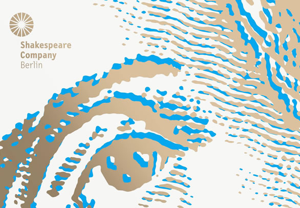
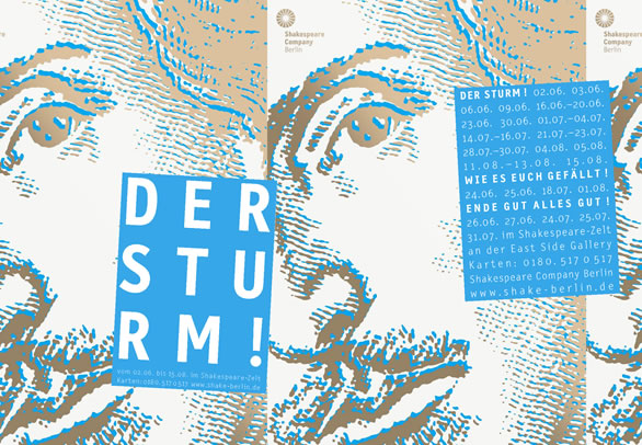
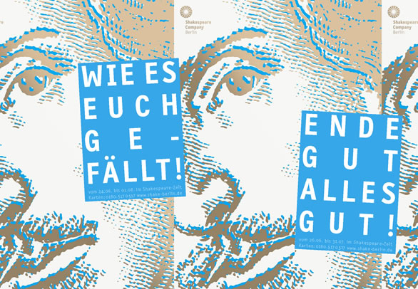
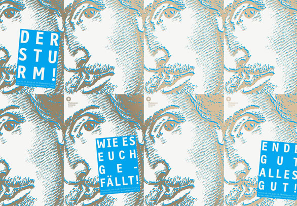
Shakespeare Company Berlin
Actors are a strange bunch: not only do they want to play all the big roles, they also want to do so in their own building. Berlin will soon have a new theatre building, modeled after the original Globe Theatre in London.
We designed a flexible system for the troupe’s printed pieces which enables them to cheaply and quickly produce their posters, flyers and programme folders.

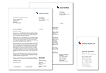
Auftraggeber
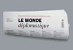
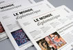
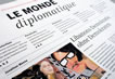
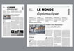
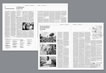
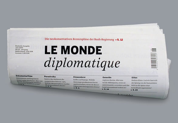
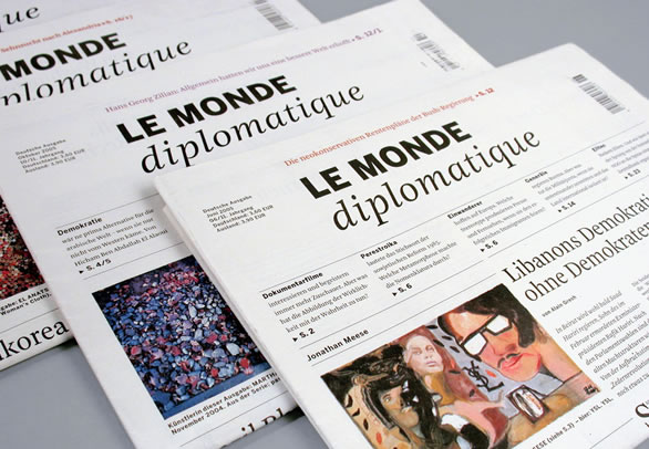
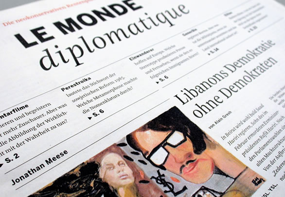
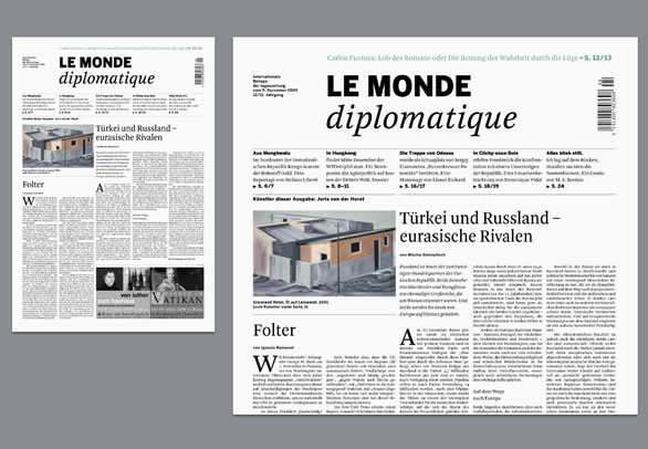
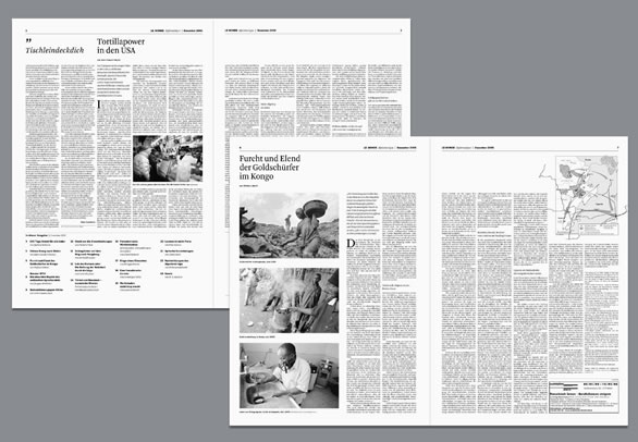
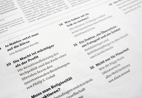
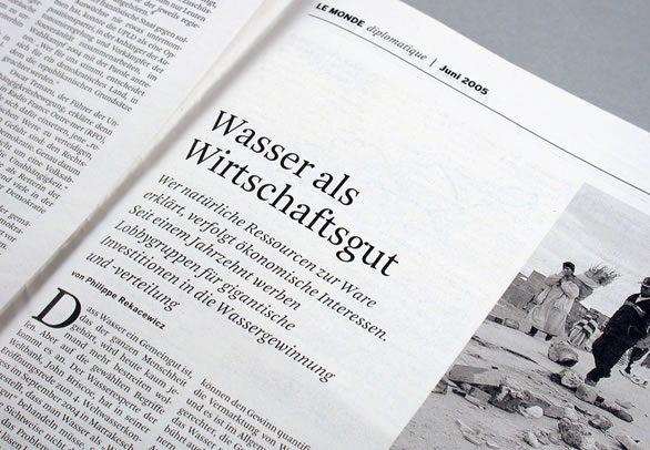
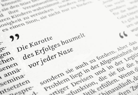
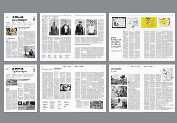
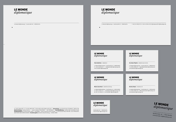
Le Monde Diplomatique
Redesign of the monthly political newspaper
Le Monde Diplomatique appears worldwide in 20 languages and 30 countries and has more than 1.5 million readers. The German edition needed a more flexible layout-system to produce generous pages, making even very long features approachable.
Auftraggeber
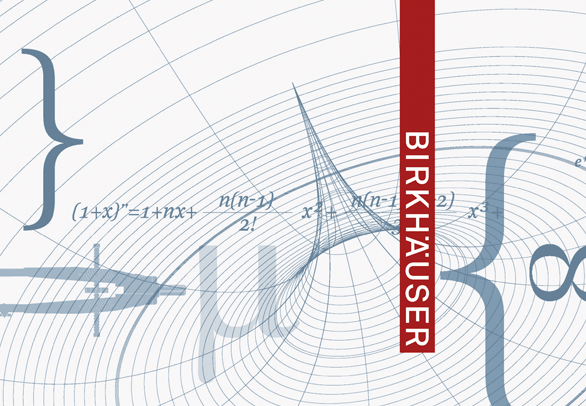
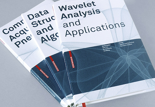
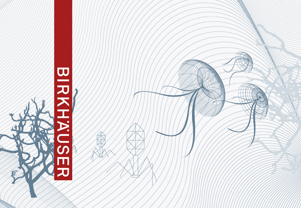
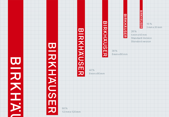
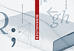
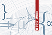
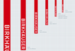
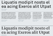
Birkhäuser Verlag
Corporate design for Birkhäuser Publishing.
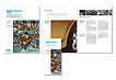
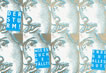
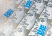
Birkhäuser is world renowned as a publisher of quality scientific literature. It is also one of the leading European publishing houses for architecture and design, with an established reputation and a strong presence on the international book market.
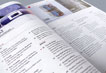
A new logo visibly combines both scientific and architecture & design publications to form one brand. It is the foundation for the whole corporate design, encompassing typography, illustration style and different colours for each different field of science. A layout system for covers and content pages achieves a unified look across all the publications whilst allowing room for highly individual titles.