Auftraggeber
Birkhäuser Verlag.
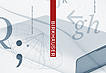
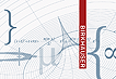
Corporate design for Birkhäuser Publishing.
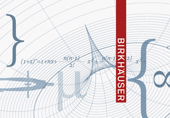
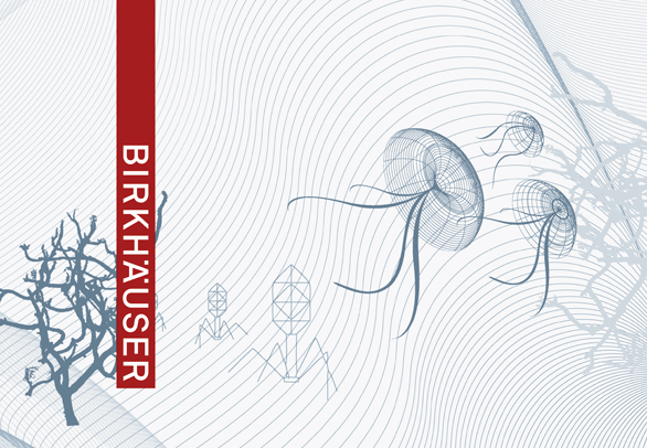
Birkhäuser is renowned throughout the world for its scientific publications. In addition, the name Birkhäuser stands for a leading European publishing house, specialising in architecture and design with an international reputation for high quality.
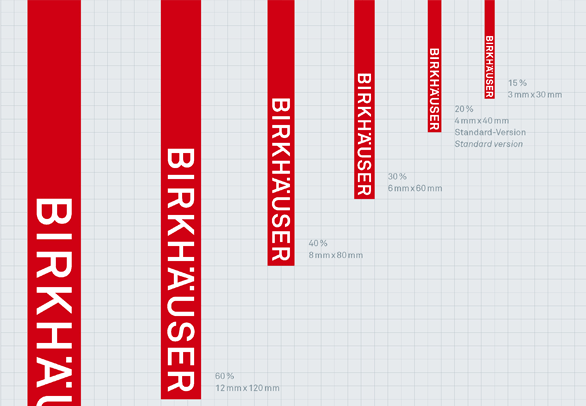
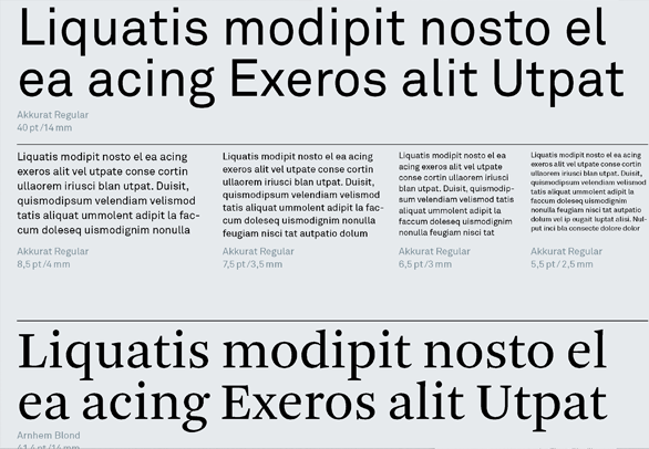
A new logo that visually combines scientific, architectural and design publications into one brand lays the foundation for the new corporate design programme which encompasses typography, image style and a comprehensive colour concept for each field of science.
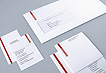
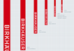
The layout system for covers and content pages ensures a coordinated look across the brand similarities whilst maintaining individuality for each particular title.