Auftraggeber
PC Professionell
It is unusual and daring for a specialised magazine like PC Professionell to alter its appearance so drastically. As designers, it was our job to tackle the contents without resorting to graphic gimmickry. The aim of the relaunch was to focus the brand image. PC Professionell’s identity as a magazine for professionals was to be clearly communicated using modern design methods.
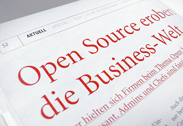
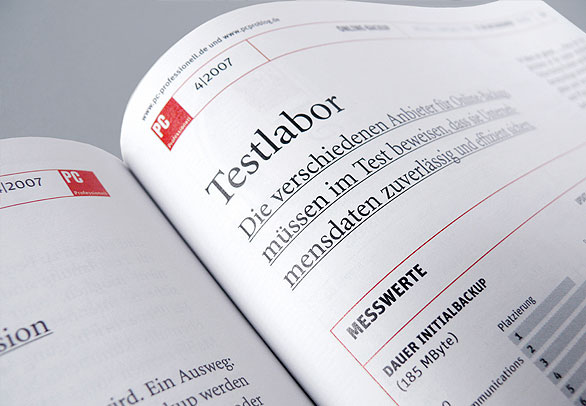
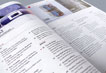
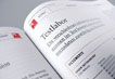
The new design defines the visual identity of PC Professionell by applying as much unity as possible and as much differentiation as necessary. It is now sleek, precise, purist and concentrated on what is essential. Copy that requires longer reading, short information snippets and hard facts for deeper perusal are all expressed typographically.
The page arrangements now make it possible to enter a text in different places and navigate between parts of the magazine without losing attention.