Auftraggeber
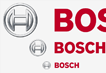
Bosch
A global company concentrates on the essential
Bosch is a global player with a considered approach to modernisation, based on decades of tradition. The new image it required was fresher and more contemporary, with all Bosch communication coming under one brand.
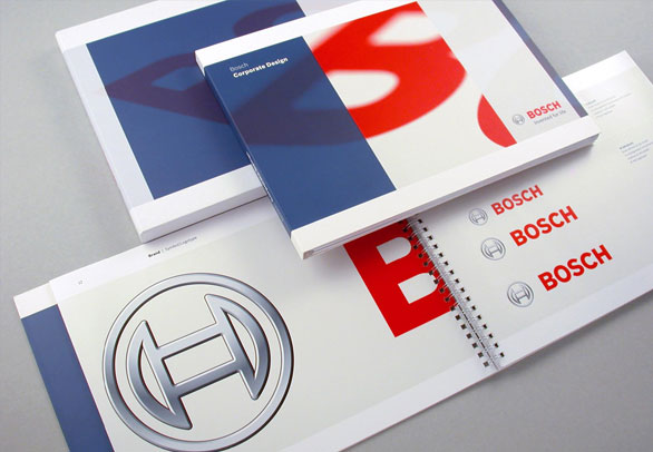
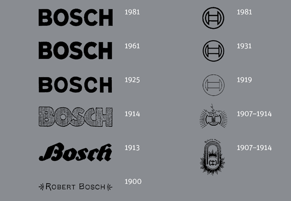
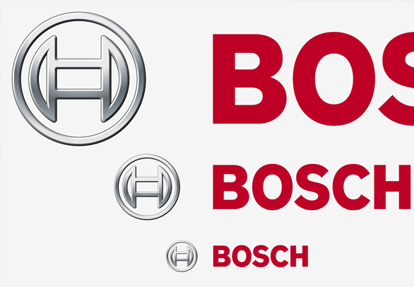
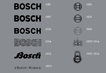
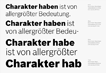
The new visual strategy unites all areas of business under one slogan. All basic elements have been reworked and redesigned, from the exclusive family of typefaces through to the colour concept and a consistent layout principle. The three dimensional symbol - the ‘Bosch anchor’ - was the starting point for modernising the brand.
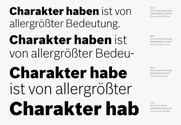
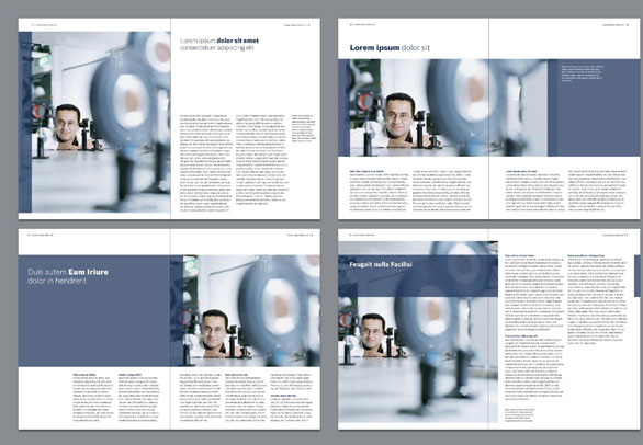
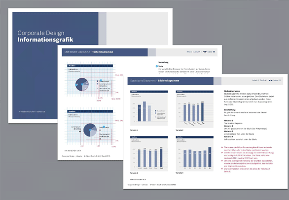
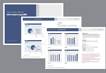
Within the framework of the new corporate design - which also includes the development of an exclusive family of typefaces - SpiekermannPartners also designed advertisements, packaging, office stationery, vehicles and trade fairs. In order to guarantee the correct application of the new corporate design, the design guidelines are laid down in a detailed corporate design manual.