- «
- Feature 11 / 11
Clients
PC Professionell
It is pretty unusual for a trade magazine to change its look as drastically as this. Our task as designers was nevertheless to make the content look good and not show off with all sorts of graphic gadgets. The aim of the re-launch was to was to precisely define the profile of the publication. A contemporary design language was to communicate PC Professional as the best test magazine for professional users.
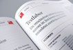
With as much coherence as possible and as much differentiation as necessary, the design now takes care of the visible identity of PC Professionell. The new cover of PC Professionell presents itself as sleek, precise and purist, concentrated on the important things.
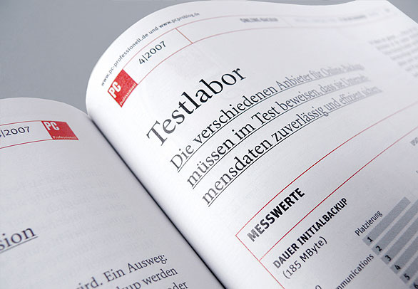
The design offers support for longer copy that needs some leisure time, for information that is scanned quickly, and for facts that need to be studied intensively. The layout makes it possible to start reading at various points in the copy, and to navigate effortlessly between parts of the magazine to pay proper attention to important facts.